Southeast Data Librarian Symposium 2022 Draft
03 Oct 2022 tagged in upennCreative Approaches to Data
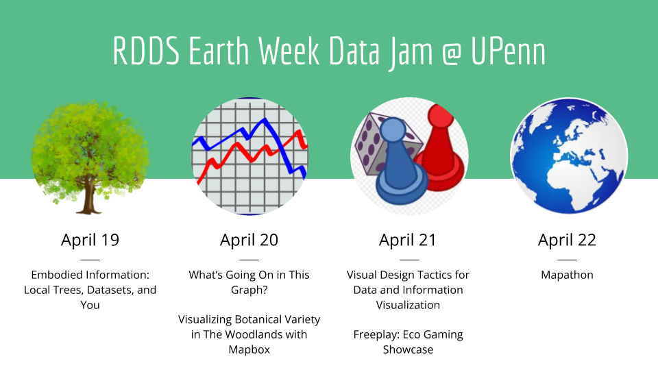
One of our values in Research Data and Digital Scholarship is creativity, as a way to engage ourselves and others in our work. For us, creativity means center our workshops and programming on wonder - taking risks, finding connections throughout the university, and recognizing how the technological and content skills expand to work outside of research data and digital scholarship. In particular, for our Earth Day workshop series this spring, we wanted to think about highlighting some key skills in data management and technology/IT knowledge - while creating analyzing, visualizing, and experimenting with data related to environmental issues and the natural world.
Part of my job is thinking about how we activate library collections in digital scholarship projects, and one of the things I wanted to highlight in our collections is the notion of data being explored through artistic practice as well as scientific inquiry. When we look beyond the technical aspects - who gathered the data, how they collected it, who created the visualization, and for what purpose - we could explore building visualizations while thinking about how representations of data coexist for different purposes.
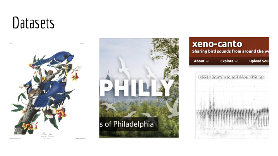
So for this workshop, entitled Creative Approaches to Data, I pulled together three datasets with related content:
- Plates from John James Audubon’s The Birds of America , considered the archetype of wildlife illustration, which is part of the Penn Libraries collection;
- the Birds of Philadelphia project on iNaturalist, a project on one of the world’s most popular nature apps for recording and sharing observations about plants and animals;
- and xeno-canto, a community-sourced website for sharing recordings of sounds of wild birds from all across the world.
These datasets all overlap in some way - their obvious bird content - and I tried to be intentional in selecting those in xeno-canto and Audubon’s work that were sourced within the Philadelphia area when possible to. maximize that overlap. They’re also datasets collected by people interested and invested in wildlife (in some capacity), with different intentions.
Using combinations of those datasets, workshop participants interrogated and created representations of the data within. We highlighted using foundational visual literacy and analysis skills in conversation with data viz skills.
First, we approached Audubon’s plates as a form of data representation. These plates represent a data collection and visualization process: Audubon and his team recorded/collected notes about bird behavior and habitat, shot and killed birds to pose them in lifelike postures, placed models on a grid background to draw them to scale, used field notes to hand-color prints. His plates are not always accurate - some are not distinct species but younger versions of others; some feature ornithological discrepancies in favor of artistic license; still others have not been sighted since Audubon’s depictions. How can we use these plates to understand data collection, what qualities and characteristics are represented about the bird, and how it functions as a data visualization of the past to inform environmental data of the present.
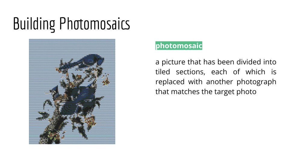
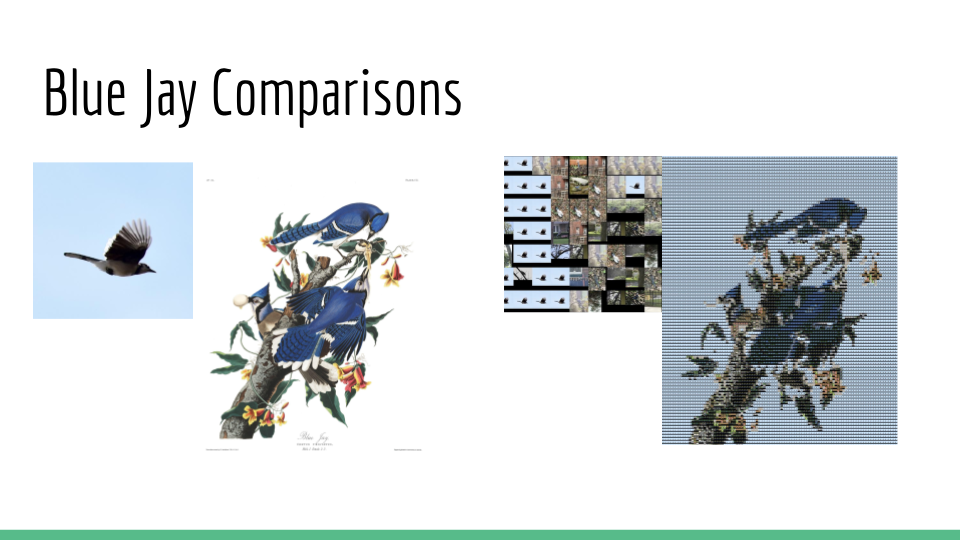
Then we created a photomosaic, using Audubon’s plates as the target photo and the Birds of Philadelphia observations as the tiled photos, to visualize the number and variety of observations of these birds in the greater Philadelphia area.
You’ve probably seen photmosaics around as a fun combination of art, photography, and computers - it’s one of the initial algorithmic art practices, and really popular for photography. Essentially, it’s a method of arranging thousands of tiny photographs (tiles) that, when viewed from a distance, combine to form a single larger image (target photo).
For birds that had many photos in the iNaturalist project, there was more variety of colorization for the photomosaic to choose from in tiles, creating an image closer to the target photo. It also shows variety - Audubon could only depict one version of the target bird, but his work represented a collection of observations and stories. We might think of Aubudon’s print as the case study, and the photomosaic as representation of all the work that led to it.
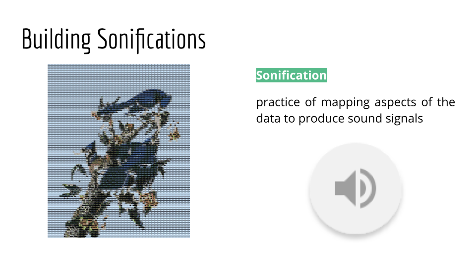
Finally, we created a sonification data story, turning data into sound to convey information or perceptualize data. We used the Birds of Philadelphia observation counts and recordings from xeno-canto, to represent sightings of a given bird in the greater Philadelphia area over the course of a year. In this particular sonification, each second represents a day, and the amplification of the sound reflects the number of sightings for a particular day.
For each of these artistic representations of data, we talked about how to view them as both art and data visualization. We would first think about the framework of art analysis - what reactions do you have, what do you notice, what questions, how does it compare? And then we would contextualize it as a data visualization or representation - what is effective here? What isn’t? What information is conveyed and in what contexts would it be helpful as a tool?
So what are the next steps?
I’m interested in running this workshop again to increase participation, and expand the conversation. Earth Day is a tough time in the semester to really engage students, but one of key points of teaching data visualization is not about how we use it to present an authoritative answer or question, but instead to present insights to inspire questions. One of the things that came up often in the workshop was how difficult it was to unite these two brains of data art and data science. Participants reacted really strongly to these different representations because they didn’t fit traditional standards of how to evaluate “good data visualization”, but they also picked up on new insights in these forms that were harder to tease out as a traditional chart or spreadsheet.
But I’m also interested in tying to those more substantial efforts within the libraries to look all our collections as datasets, not just the datasets we make public but those that are represented within in. And to understand how visualization has long been an art tool in itself, something we widely use now in things like dataset critique, and that extends to how we talk about teach data to our patrons. Some takeaway questions for participants:
- How do we engage data literacy that accounts for the myriad ways students approach and engage with data in and out of the classroom?
- How can we recognize the limitations and affordances of each visualization or transformation, especially in new formats that don’t have the same types of standards?
- How do we talk about data art - both historical and contemporary - in the history of data communication?
- And finally, how do we focus on making these workshops fun and highlight how the skills we learn in data viz can be creative as well as educational?
Credits
- Nathan Buchar, Audubon Bird Plates, (2022), GitHub repository, https://github.com/nathanbuchar/audubon-bird-plates. Images of Audubon plates available courtesy of the John James Audubon Center at Mill Grove, Montgomery County Audubon Collection, and Zebra Publishing.
- Data DoLittle, Photo Mosaic using Python, (2021), GitHub repository, https://github.com/Datadolittle/Photo_Mosaic. Released via an MIT License.
- iNaturalist contributors, iNaturalist (2022). Birds of Philadelphia. iNaturalist.org. Occurrence dataset http://www.inaturalist.org/observations/export?has%5B%5D=photos&quality_grade=research&identifications=any&verifiable=true&projects%5B%5D=birds-of-philadelphia accessed via iNaturalist.org on 2022-04-18.
- Vellinga W (2022). Xeno-canto - Bird sounds from around the world. Xeno-canto Foundation for Nature Sounds. Occurrence dataset https://doi.org/10.15468/qv0ksn accessed via GBIF.org on 2022-04-04.